HTML Layouts
Example
<!DOCTYPE html>
<html>
<head>
<style>
div.container {
width: 100%;
border: 1px solid gray;
}
header, footer {
padding: 1em;
color: white;
background-color: blue;
clear: left;
text-align: center;
}
nav {
float: left;
max-width: 160px;
margin: 0;
padding: 1em;
}
nav ul {
list-style-type: none;
padding: 0;
}
nav ul a {
text-decoration: none;
}
article {
margin-left: 170px;
border-left: 1px solid gray;
padding: 1em;
overflow: hidden;
}
</style>
</head>
<body>
<div class="container">
<header>
<h1>City</h1>
</header>
<nav>
<ul>
<li><a href="#">Germany</a></li>
<li><a href="#">Paris</a></li>
<li><a href="#">Tokyo</a></li>
</ul>
</nav>
<article>
<h1>Germany</h1>
<p>Various Germanic tribes have inhabited the northern parts of modern Germany since classical antiquity. A region named Germania was documented before 100 AD. During the Migration Period, the Germanic tribes expanded southward. Beginning in the 10th century, German territories formed a central part of the Holy Roman Empire.[11] During the 16th century, northern German regions became the centre of the Protestant Reformation. After the collapse of the Holy Roman Empire, the German Confederation was formed in 1815. The German revolutions of 1848–49 resulted in the Frankfurt Parliament establishing major democratic rights.</p>
</article>
<footer>Copyright © e-learningwebdesigning.blogspot.com</footer>
</div>
</body>
</html>
Result
HTML Layout Elements
Websites often display content in multiple columns (like a magazine or newspaper).
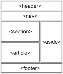
HTML5 offers new semantic elements that define the different parts of a web page:
 |
- <header> - Defines a header for a document or a section
- <nav> - Defines a container for navigation links
- <section> - Defines a section in a document
- <article> - Defines an independent self-contained article
- <aside> - Defines content aside from the content (like a sidebar)
- <footer> - Defines a footer for a document or a section
- <details> - Defines additional details
- <summary> - Defines a heading for the <details> element
HTML Layout Techniques
There are four different ways to create multicolumn layouts. Each way has its pros and cons:
- HTML tables
- CSS float property
- CSS framework
- CSS flexbox
CSS Frameworks
If you want to create your layout fast, you can use a framework, like e-learningwebdesigning.css or Bootstrap.
CSS Floats
It is common to do entire web layouts using the CSS float property. Float is easy to learn - you just need to remember how the float and clear properties work. Disadvantages: Floating elements are tied to the document flow, which may harm the flexibility. Learn more about float in our CSS Float and Clear chapter.
Example
<!DOCTYPE html>
<html>
<head>
<style>
div.container {
width: 100%;
border: 1px solid gray;
}
header, footer {
padding: 1em;
color: white;
background-color: blue;
clear: left;
text-align: center;
}
nav {
float: left;
max-width: 160px;
margin: 0;
padding: 1em;
}
nav ul {
list-style-type: none;
padding: 0;
}
nav ul a {
text-decoration: none;
}
article {
margin-left: 170px;
border-left: 1px solid gray;
padding: 1em;
overflow: hidden;
}
</style>
</head>
<body>
<div class="container">
<header>
<h1>City</h1>
</header>
<nav>
<ul>
<li><a href="#">Germany</a></li>
<li><a href="#">Paris</a></li>
<li><a href="#">Tokyo</a></li>
</ul>
</nav>
<article>
<h1>Germany</h1>
<p>In the 21st century, Germany is a great power and has the world's fourth-largest economy by nominal GDP, as well as the fifth-largest by PPP. As a global leader in several industrial and technological sectors, it is both the world's third-largest exporter and importer of goods.</p> <p>Germany is a developed country with a very high standard of living sustained by a skilled and productive society. It upholds a social security and universal health care system, environmental protection and a tuition-free university education</p>
</article>
<footer>Copyright ©
e-learningwebdesigning.blogspot.com</footer>
</div>
</body>
</html>
Result
CSS Flexbox
Flexbox is a new layout mode in CSS3.
Use of flexbox ensures that elements behave predictably when the page layout must accommodate different screen sizes and different display devices. Disadvantages: Does not work in IE10 and earlier.
Learn more about flexbox in our CSS Flexbox chapter.
Example
<!DOCTYPE html>
<html>
<head>
<style>
.flex-container {
display: -webkit-flex;
display: flex;
-webkit-flex-flow: row wrap;
flex-flow: row wrap;
text-align: center;
}
.flex-container > * {
padding: 15px;
-webkit-flex: 1 100%;
flex: 1 100%;
}
.article {
text-align: left;
}
header {background: blue;color:white;}
footer {background: green;color:white;}
.nav {background:#eee;}
.nav ul {
list-style-type: none;
padding: 0;
}
.nav ul a {
text-decoration: none;
}
@media all and (min-width: 768px) {
.nav {text-align:left;-webkit-flex: 1 auto;flex:1 auto;-webkit-order:1;order:1;}
.article {-webkit-flex:5 0px;flex:5 0px;-webkit-order:2;order:2;}
footer {-webkit-order:3;order:3;}
}
</style>
</head>
<body>
<div class="flex-container">
<header>
<h1>City</h1>
</header>
<nav class="nav">
<ul>
<li><a href="#">Germany</a></li>
<li><a href="#">Paris</a></li>
<li><a href="#">Tokyo</a></li>
</ul>
</nav>
<article class="article">
<h1>Germany</h1>
<p>The Federal Republic of Germany was a founding member of the European Economic Community in 1957 and the European Union in 1993. It is part of the Schengen Area, and became a co-founder of the Eurozone in 1999. Germany is a member of the United Nations, NATO, the G7 (formerly G8), the G20, and the OECD</p>
<p>The national military expenditure is the 9th highest in the world.</p>
<p><strong> Known for its rich cultural history, Germany has been continuously the home of influential and successful artists, philosophers, musicians, sportspeople, entrepreneurs, scientists, engineers, and inventors.</strong></p>
</article>
<footer>Copyright ©
e-learningwebdesigning.blogspot.com</footer>
</div>
</body>
</html>
Result


Comments
Post a Comment